
Learning a Foreign Language
Criticise This - Part Two

In many respects, asking the question “what do you think of this?” is the easy part of the critical review process. Deciding what to do with the responses is altogether more difficult. Regular readers will know I usually reply to many of your comments, and on the previous post I stayed what might seem uncharacteristically quiet. That’s because I wanted the comments to marinate in my brain for a few days before responding. Too many “and your mother too” knee-jerk reactions from me wouldn’t be advancing our creative cause. I wasn’t offended or annoyed by any of what was said, and in return I’d encourage you not to be offended by my analysis of it. Thank you to those who commented on the post.
Interpreting critical feedback is like learning a foreign language. Often not all parties are speaking the same one. It takes some work to make sense of what is being said and get something useful from it. I’ve found that it’s best to try and group the comments in a kind of sifting exercise. Lifting the biggest lumps from the litter tray of opinion, if you will. At the risk of being reductive, I think the points of view fall into some recognisable groups:
The Comparators are characterised by their “it looks like a…[insert name of household object here]” format of commenting. This is an entirely normal human reaction - when faced with the unfamiliar we’re inclined to search our memory banks for other things that were a bit like this, to comfort our monkey brains. Once we’ve found the “oh yes it’s like an XXX”, we can go back to eating bananas and grooming ourselves. Whilst this approach satisfies the commenter (“well I put that into a box and now I can move on”) it really gets the receiver nowhere - you can’t do anything with it, so they go in the bin.
The Engineers are following a utility paradigm, where they want to improve the object by increasing it’s functionality. So this is the “you should add more drawers/shelves/cupholders” school of thought. At it’s worst where this gets you to is The Homer, which is not where we want to be. Whilst well meaning, unless you’re designing some kind of multi-function shop cart, these comments go in the bin too. Chances are you already had the features or capacity you needed in the design in the first place. More is not always better.
The Fixers want to solve your design like a Sudoku. Woodworkers tend to be practical people and are eager to get the solution down. A sub-set of the Fixers are the Re-Designers, who will even send you a drawing of what you should have done. Sometimes there might be value in the ideas, but then this is someone else’s take on your design, so you have to be a bit careful what you take forwards to avoid losing the integrity of your original concept.
The Opinioneers know what they like and dislike, but not why. Whilst we might all like to receive the “I like it so much it made me come” comments, they are no more useful to us than the “it’s a total piece of shit” ones. To be fair no-one actually said either of those. The issue with opinion comments, to which everyone is entitled, is that you can’t really action them. You can take an average of the views and get a broad sense of whether most people were positive or not, which is what I advocate. It’s best not to focus on any individual positive or negative comment if you can avoid it. Easier said than done in my experience.
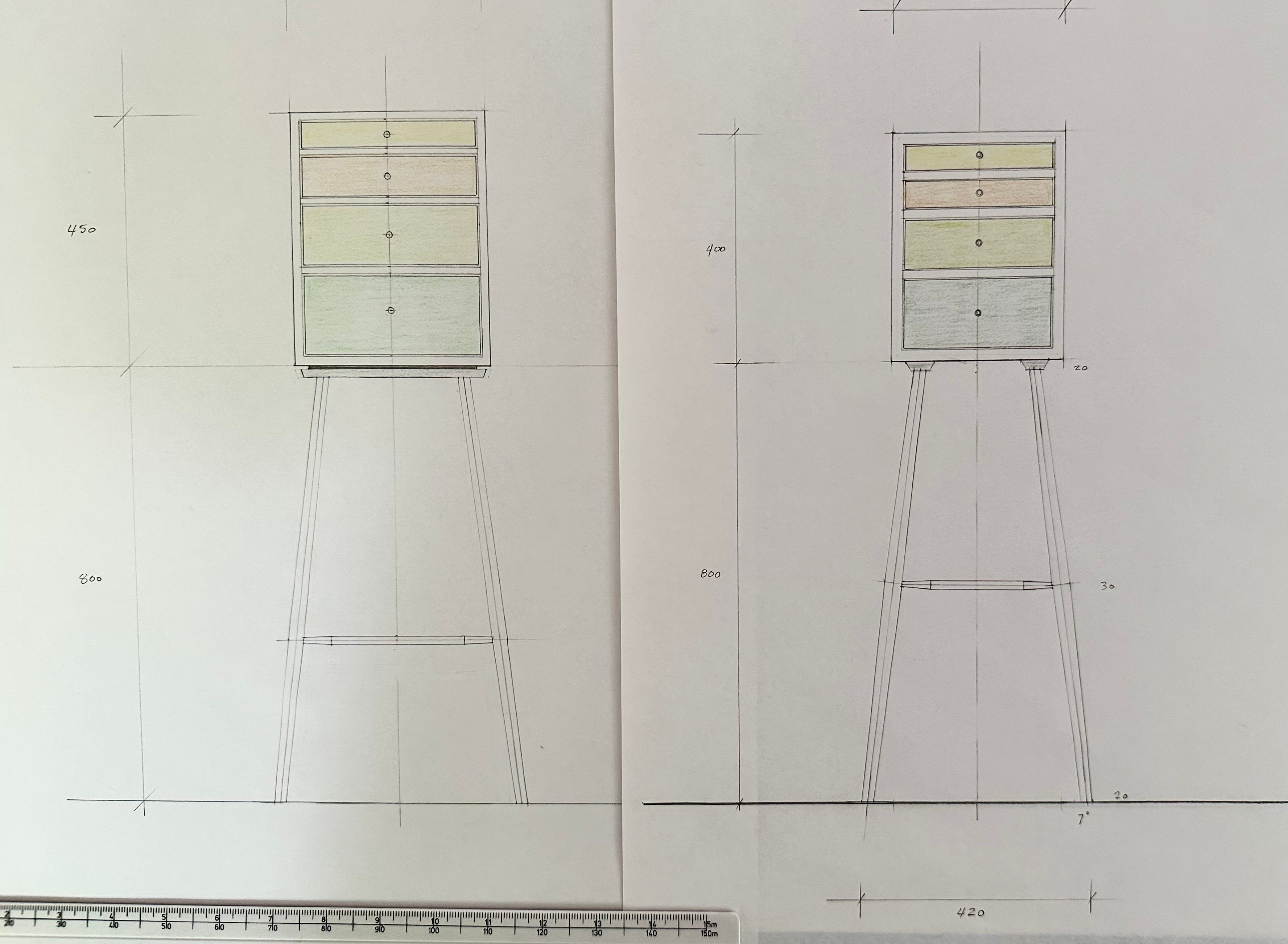
We need to weed out the contradictory comments. If you’ve got a fairly even balance of “it’s top heavy” with “it’s bottom heavy” you can probably categorise this as a matter of opinion. In that case, it’s down to you as the designer to make the casting vote. But if there is a groundswell of opinion in one particular direction, it’s probably worth taking note of that view. In the case of this critique, we have to bear in mind that the commenters only represent about 0.01% of the people who received the original post, so it is a pretty small sample size. Even so, there was a general view that the base was visually heavy in comparison to the top, so I’ve looked at that in my re-design. I did allude to this in one of my image captions, so I was kind of already there.
Whilst I don’t purport to be an artist (bear with me, I’m not going to start naming my pieces) art is meant to be subjective and divide opinion. We all see the same objects differently, and hurrah for that. This is why we don’t all choose the same car, want to marry the same person or wear the same clothes. Beauty really is in the eye of the beholder. My point is that we aren’t likely to get to a sweet spot where everyone likes a design. Some commenters on the original post don’t like cabinets on stands, so we’re never going to please those people. I recommend pleasuring yourself as the first priority.
So why ask for critical opinion at all if you’re just going to ignore it? Well the answer is firstly that I’m not going to throw it all away, but equally I probably won’t action any one specific comment in isolation. Instead it’s useful as a catalyst to get us thinking about our own design. It can force you to confront things you knew deep down yourself, but maybe supressed. What we should take are the themes that run through the comments and respond to those as a designer. That way you’re taking the temperature of opinion, but preserving your own design integrity.
So here’s what I changed. The case got slightly larger, the case sides got slightly thinner and the top two drawers that were previously equal are now graduated. The case now sits on a plinth with a shadow gap, rather than the battens I had before. I also amended the base, to use a slightly thinner leg section with a less dramatic taper and a lower stretcher. I might tinker with the width of the base slightly when I come to make it, but the angles will remain the same. I drew it with a lesser splay and it didn’t look right. I’ll make the case first and then see what I think when I get to that point.

Here’s a side by side comparison. Although the overall balance feels better, the base has lost a little of it’s dynamism for me, so I might ruminate on that while I make the top part. At that point I’ll be able to mock up a base and have a full size model to gaze at while I finalise the plans. Maybe I’ll model it in Sketchup too.
If anyone wants to comment more, knock yourselves out, but I am setting off with the top part of this as it’s now drawn, so please don’t feel you need to. Maybe I’ll get bored of it and never make the base. Who can say?
Hey Ed, thank you for sharing your process.
I like the new proportions, the rhythm is more funky, less stiff. As in music, it adds tension, draws the eye and with that makes it interesting.
As an idea: I own an old chest of drawers with three graduated drawers - as is common - but the bottom and middle drawers were switched so it goes small-large-medium from top to bottom. I found this an appealing solution to adding visual interest. (I’ve been wanting to copy that design-aspect for years, unfortunately I don’t build furniture and spend my days trying to convince others to try it, wink)
Cheers, Nik
Sorry I missed round one. I must have been on that peasant guy’s blog or watching reels on instagram. Make sure the base and cabinet look like they belong to each other. It’s does in version 1 but version 2 might be wavering. Three drawer instead of four? I like odd numbers, 3 drawers, 5 slats, seven spindles.. etc, etc,. maybe do a 3d mock up with cardboard box and dowels. I like the piece. Taking Windsor chair techniques into the realm of case goods is a good endeavor.