
Criticise This
On improving our designs

As an Architecture student in the early 90’s, the regular events that loomed large in my diary were Crits*. Short for critique, this is a design review of your work by the course tutors. On a design degree like Architecture, most of the work is project based and you’re expected to work independently for periods of time. Crits are used along the way to look at what you’ve done in that time and give feedback, as well as discussing where you’re headed next. Sounds straightforward enough, but for groups of mostly 18-21 year olds it can be a harrowing and anxiety-inducing process.
*the French call it a Charrette.
A French Architect I met in London told me this comes from the name for the cart that would be wheeled around the studio to collect the drawings and models prior to the critique, with the porters calling out “Charrette, Charrette” to chivvy along the late finishers as they walked through the atelier. Apparently it originated at the École des Beaux-Arts in Paris in the 1800’s. By 1992 in Newcastle-upon-Tyne this had been reduced to pinning your drawings to the walls of the crit room and waiting for judgement to be handed down. Then getting spectacularly drunk afterwards, whether good or bad. I imagine the French students did that part too.
The idea of pinning your work to the wall, arguing for it’s merits in front of an audience of your peers, then defending what you’ve done in the face of experienced professionals is sound enough. I found the reality for sleep starved students, who’ve worked through the night before to get finished a little different. Taking criticism isn’t easy for anyone, and I know I was far more hard-headed when I was 20 than I am as I approach 50. But I’m still not very good at receiving feedback.
I now understand, but didn’t appreciate then, that design is almost always improved by peer review. Different eyes perceive things we didn’t ourselves see and feedback can open our minds to alternatives. These days my work life is occupied with tendering for construction projects and I know we learn far more to improve things when we lose a bid, than when we win. But that doesn’t mean there was nothing to be improved on a winning bid, you just never find out because you don’t ask the question. I think the same is true of design.
One of the infuriating things about design review is subjectivity. We don’t all like the same things and often two reviewers will have entirely different points of view about the same object. On the receiving end it can be hard to sift through those comments and understand what to do next. There’s no easy answer to that, but the main tool I advocate is to ask commenters to tell us why, not just what they think. Then at least you can test those reasons against what you were trying to achieve in the first place. Ultimately if you design things as a hobby you’re free to reject any feedback you don’t like, but it’s healthy to allow design work to be challenged to test your own resolve.
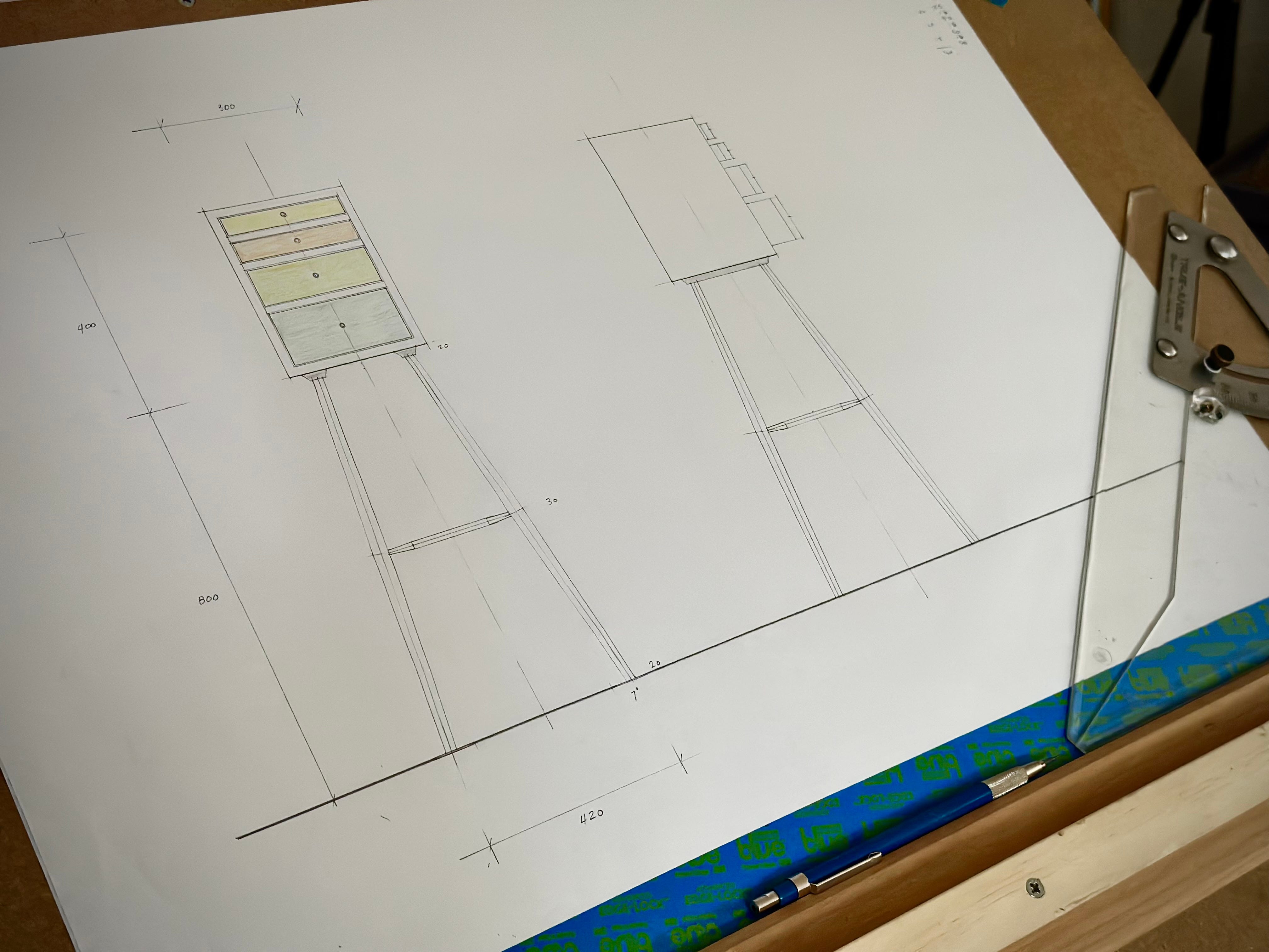
I actually did this once before on Instagram with a chair design and the feedback led to changes that genuinely improved the design. Social media can be a cruel mistress when it comes to comments, but I found the process very positive in that instance. So I thought I’d do it again. Here is my initial drawing for the next project I plan to build. It’s a small cabinet on stand, maybe more than a little Krenov looking, using some chairmaking techniques in the stand.
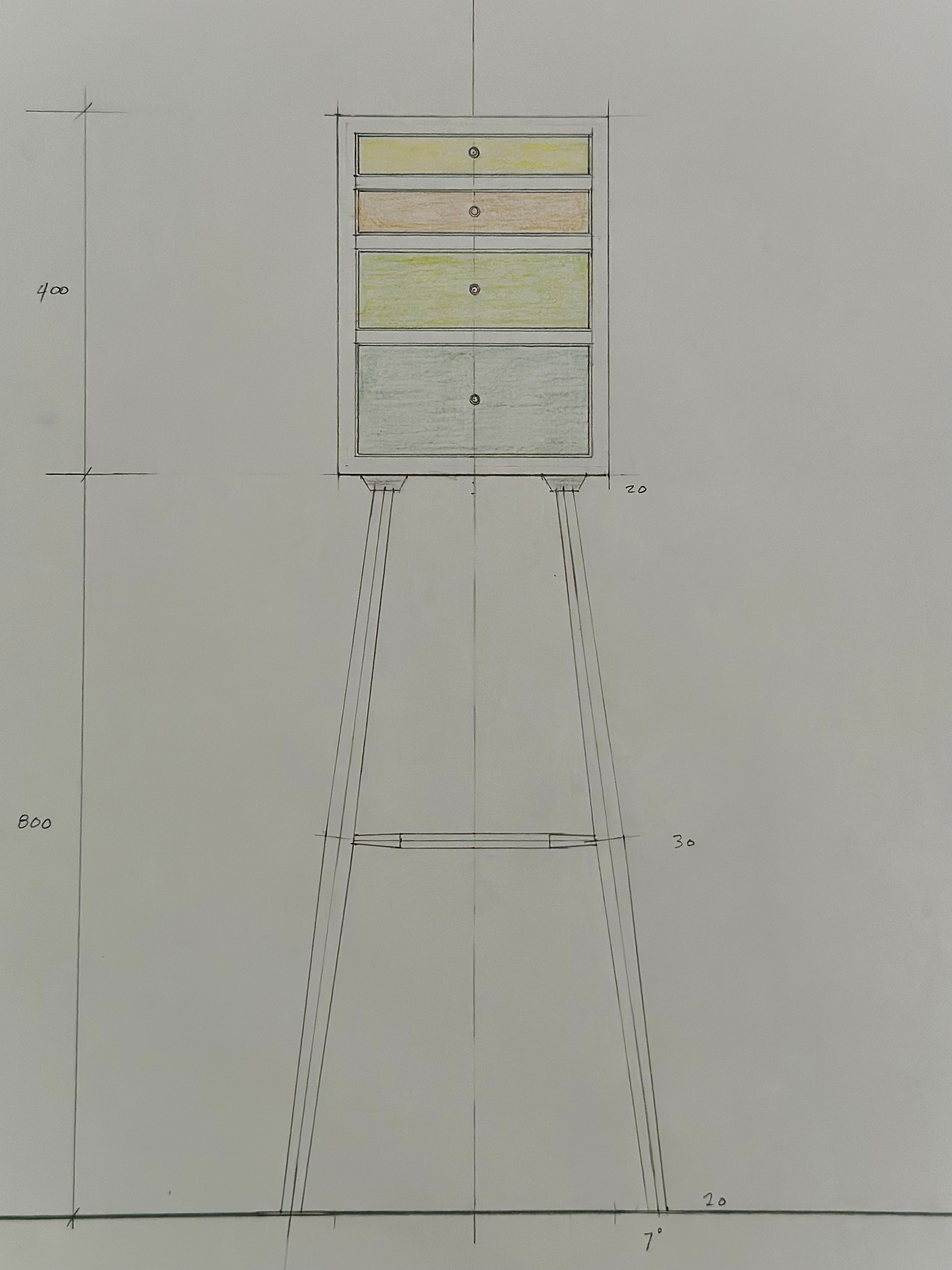
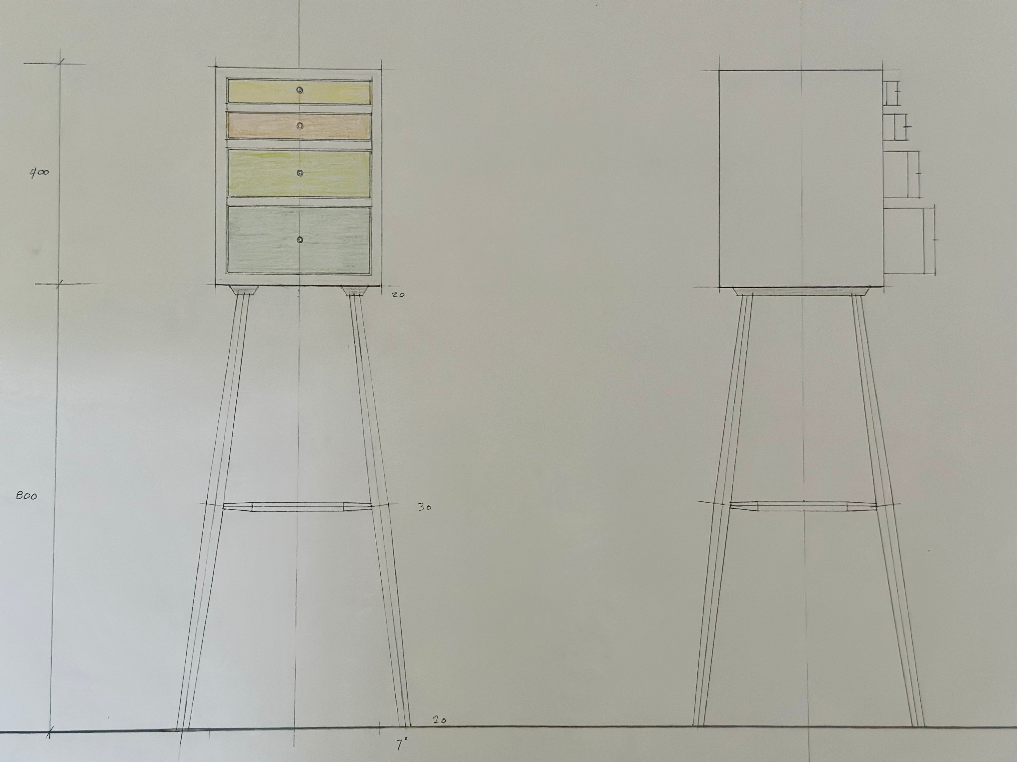
Opinions are like arseholes - everyone has got one. And I want to see yours (let’s hope that doesn’t lead to any confusion). So I offer my design for review and invite you to say what you think. There’s only one rule. You can say whatever you want about my design. I don’t mind if you like it, or don’t like it, but in either case you have to say why you think that. If you don’t give a reason, good or bad, I will delete the comment. That might sound churlish, but an unexplained like or dislike gets us nowhere. What we need are reasons if we are to actually get something from the review process.
In other news, I am healing well and hope to be back woodworking next week.
Hi Ed, Best wishes for a complete and speedy recovery. My first impression is that there is a dissonance between the base and the chest. I think you should either lean more into the Krenovian style with a more rectilinear base or change the chest of drawers to pick up the taper of the legs. I also think the proportions are off. The chest of drawers is too small in relation to the height of the base. I would play with those dimensions until I found a combination that was more pleasing. Shorten the legs, taper the drawer unit and make it slightly taller with a slightly wider base to be more in line with the bottom of the legs. The method of leg attachment seems a bit clunky. I'd think about creating the base as a separate unit with the legs mortised into the top like legs into a chair seat. Then attach the chest of drawers to the base in a way that drawers appear to be floating above the base by 3/4" or so. I've done a quick pencil sketch of my suggested modifications and now, whatever the outcome, you've sent me off on designing a new project of my own. Thank you for the inspiration.
It was interesting to read about the critique process for architects and look at the parallels to engineering. Basically just strip out all the art and subjectivity, and if a reviewer starts a sentence with, “I think…” and never provides reasoning for it (with backup data, if asked), they don’t get invited to the next design review.
That said, as a mechanical design engineer, I find myself completely and utterly incapable of providing feedback for this cabinet without knowing what its end use will be. I suppose that’s the great thing about a cabinet, you can store art supplies in it for a while, then your rubber duck collection in it later. And if you’re making it to sell, the end use is none of your damn business.
This is probably why I’ll never be a decent furniture designer/maker.
The only critique I could give that isn’t purely devoted to its function, to which I am ignorant of, is that the ratio of positive to negative space seems off. It looks, to my eyes, like a skeletal structure with a cabinet perched atop it, rather than a cabinet with legs beneath it. But maybe that was the creative vision? I would probably either scale the cabinet up by ~25% or plow some grooves in the stretchers to inset a little shelf in there for a plant or something. That would destroy the skeletal nature of the structure, but would cure some of the wasted space, which is the part of the whole thing that really doesn’t sit well with my form-driven-by-function engineer brain.
I thoroughly enjoy your blog, by the way. Thank you for taking the time to share your thoughts and experiences in such a well-written manner.